Chosen theme: Color Palettes in Scandinavian Interiors. Step into a calm, light-filled world where nuanced neutrals, nature-kissed accents, and honest materials create spaces that breathe. We’ll explore how Nordic color choices honor daylight, embrace texture, and tell quiet, human stories. Subscribe for palette checklists, seasonal tips, and fresh inspiration tailored to your home.

The Nordic Philosophy of Color

In the Nordics, long winters and low sun make daylight precious. Colors are chosen to reflect, diffuse, and soften available light. Whites, grays, and pale woods form a luminous base that prevents rooms from feeling flat, even on the dimmest days.
Scandinavian interiors avoid visual clutter, using restrained palettes to reduce stress and highlight function. By keeping hues cohesive, every object breathes. A single ceramic bowl in sea-glass green becomes art when the backdrop whispers instead of shouts.
Nordic palettes look outward for guidance: lichen on granite, misty shorelines, dried grasses in late autumn. These references yield grounded colors that age gracefully. Ask yourself, which landscape comforts you most, and how could its tones shape your favorite room?

Choosing the Right White

Not all whites behave equally. Cool whites can turn icy in north-facing rooms, while warm whites flatter low winter light. Test swatches across a full day; compare against flooring and textiles to prevent unwanted yellowing, starkness, or shadowy corners.

Layering Grays Thoughtfully

Gray sings when layered across tone and texture: carbon pencil, soft dove, foggy steel. Balance cool and warm grays with wood tones to avoid sterility. A graphite lamp on pale gray plaster adds depth without sacrificing the palette’s calming cadence.

Beige, Greige, and Gentle Warmth

Greige blends gray’s sophistication with beige’s warmth, ideal for homes needing coziness without heaviness. Pair greige walls with oiled oak floors and off-white linen curtains. The result feels quietly sunlit, even when cloudy, inviting tactile materials to do the talking.

Nature-Inspired Accents: Forest, Fjord, and Sky

Sage, olive, and pine create connection to forests and fields. A moss throw on a gray sofa, or a muted green cabinet, brings life without chaos. These greens feel restorative, particularly when paired with pale wood and ceramic pieces in chalky finishes.

Nature-Inspired Accents: Forest, Fjord, and Sky

Inspired by fjords and night skies, blue accents bring quiet drama. Try midnight blue cushions, indigo rugs, or cobalt glassware. Blues temper warmer woods, giving equilibrium. Keep saturation measured so rooms remain contemplative, not nautical theme parks.

Pastels with Purpose, Not Preciousness

A muted blush reads as sophisticated when anchored by gray and black accents. Think blush linen cushions on a pale oak bench. The color should feel like diffused dawn light rather than candy, offering warmth without veering overtly pink or sugary.

Pastels with Purpose, Not Preciousness

Matte powder blue on cabinetry can calm busy kitchens, especially with honed stone and brushed steel. Keep hardware simple, allowing the color’s softness to center focus. Test under task lighting; overly cool bulbs can tip blue toward sterile, losing charm.

Light, Seasons, and Color Temperature

North light is cool and consistent. Warm whites, greige, and honeyed wood counterbalance this coolness beautifully. Avoid stark blue-grays that can feel chilly. Introduce candlelight, wool textures, and warm metal accents to enliven evenings without breaking the palette’s serenity.

Light, Seasons, and Color Temperature

Abundant sun can wash out delicate tones. Choose slightly deeper hues—dusty blues, mid-tone grays, and soft taupes—to maintain presence. Sheer curtains diffuse glare while preserving luminosity. Plants thrive here, adding fresh green that reads vivid but still classically Scandinavian.

Materials and Finishes that Honor the Palette

Oiled oak warms gray palettes; ash keeps things pale and modern; pine introduces softness with character. Avoid overly orange stains that fight cool neutrals. Let grain show through, pairing with wool and linen to maintain a tactile, light-reflective atmosphere.

Materials and Finishes that Honor the Palette

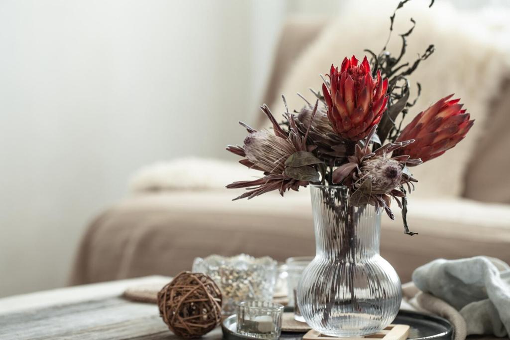
Matte paints and finishes reduce glare, letting colors read as velvety and calm. Glossy surfaces can feel out of place unless deliberately used for contrast in small accents. A matte ceramic vase against limewashed walls creates quiet depth without visual noise.

Room-by-Room Palette Playbooks

Start with warm white walls, pale oak floors, and dove-gray upholstery. Layer a graphite lamp and midnight blue cushions for depth. Add a moss throw and black metal side table, keeping art minimal so textures and gentle tones carry the conversation gracefully.

Room-by-Room Palette Playbooks

Choose matte powder blue or light gray cabinetry, honed stone counters, and ash shelves. Use sandy ceramics, brushed steel hardware, and a rust linen runner to warm the scheme. Under-cabinet lighting with warm bulbs protects color fidelity during long winter evenings.

Room-by-Room Palette Playbooks

Greige walls, linen bedding in dusty sage, and a wool rug anchor serenity. Keep nightstands simple in pale wood, adding a single indigo throw for gentle contrast. Black reading lamps punctuate the room like commas, helping the eyes settle before sleep.
Grandmetallic
Privacy Overview

This website uses cookies so that we can provide you with the best user experience possible. Cookie information is stored in your browser and performs functions such as recognising you when you return to our website and helping our team to understand which sections of the website you find most interesting and useful.